If you read my blog, and know me at all, you know I LOVE pastels. Pastels make me happy. Especially when they are in my hair! Well the PANTONE® COLOR OF THE YEAR 2016 has been announced, and get ready for this… it’s a duo! Yes for the first time the colour of the year is actually a modern color story of two shades. Serenity and Rose Quartz. Serenity 15-3919 is a beautiful soft cool tranquil blue. Rose Quartz 13-1520 is a warmer soft rose. The two together create a soothing and peaceful vision of pastel perfection. It is such a refreshing change from the more vibrant and intense PANTONE Color of the Years of the past.
The announcement of the new color of the year brings the new SEPHORA + PANTONE UNIVERSE Color of the Year 2016 Collection. An assortment of makeup for eyes and lips that interprets the colors of innocence and expressionism into a bold new palette of modern watercolors. I have been quite impressed with the formulations of the products in the past SEPHORA + PANTONE UNIVERSE Color of the Year collections so I am excited to experiment with this new collection.
“With the whole greater than its individual parts, joined together Serenity and Rose Quartz demonstrate an inherent balance between a warmer embracing rose tone and the cooler tranquil blue, reflecting connection and wellness as well as a soothing sense of order and peace,” Leatrice Eiseman, Executive Director of the Pantone Color Institute™.
The soft shade of Serenity relates well to sister shades of blue, and is elegant with gray, olive, orchid and taupe. It takes on an earthier feel with deep lichen green, sage, cedar, shitake and sepia brown, and is easily compatible with more vibrant greens and yellows. Rose Quartz pairs easily with dove gray, lilac and violet, or juxtaposed against deliciously deep chocolates, greens and apricots. For something more unexpected, turn up the heat with pale gold, and warm tones of peach, orange and tan, or add dramatic contrast with peacock blue and deep jungle greens. The exclusive cosmetics collection, designed by SEPHORA, evokes the sleek, modern lines of the iconic PANTONE Color Chip with a captivating watercolor design inspired by abstract art. Each item features Sephora Collection’s high performance formulas that offer rich color payoff and a luxurious feel during wear, with refined finishes like matte, shimmer, satin and shine. I am so in love with the gorgeous packaging for this collection and the variety of pretty soft shades in the lip products. I feel like I could just stare at the prettiness all day.
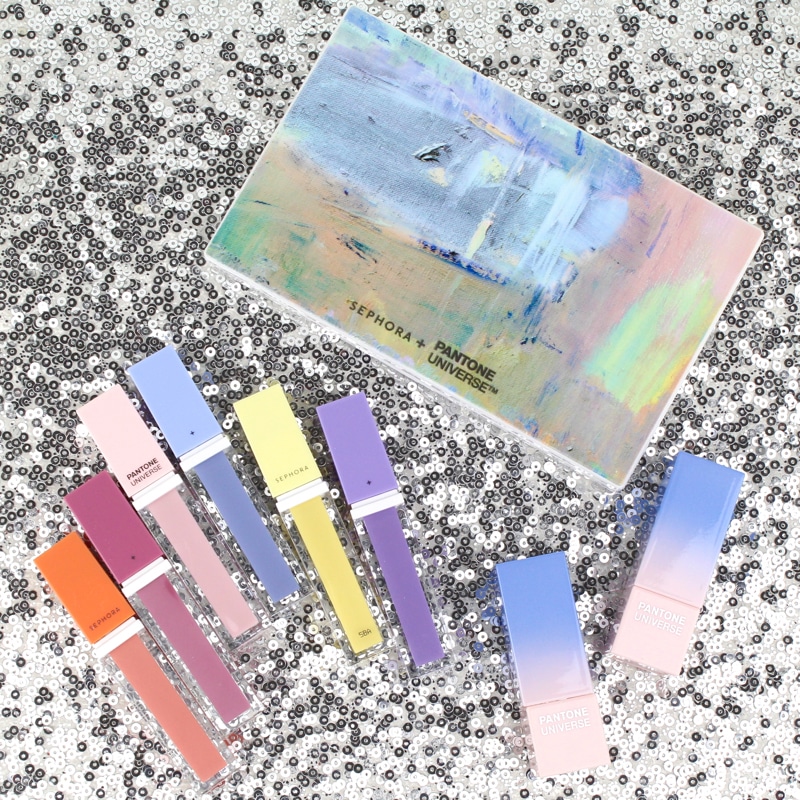
The pastel watercolour packaging is absolutely beautiful.
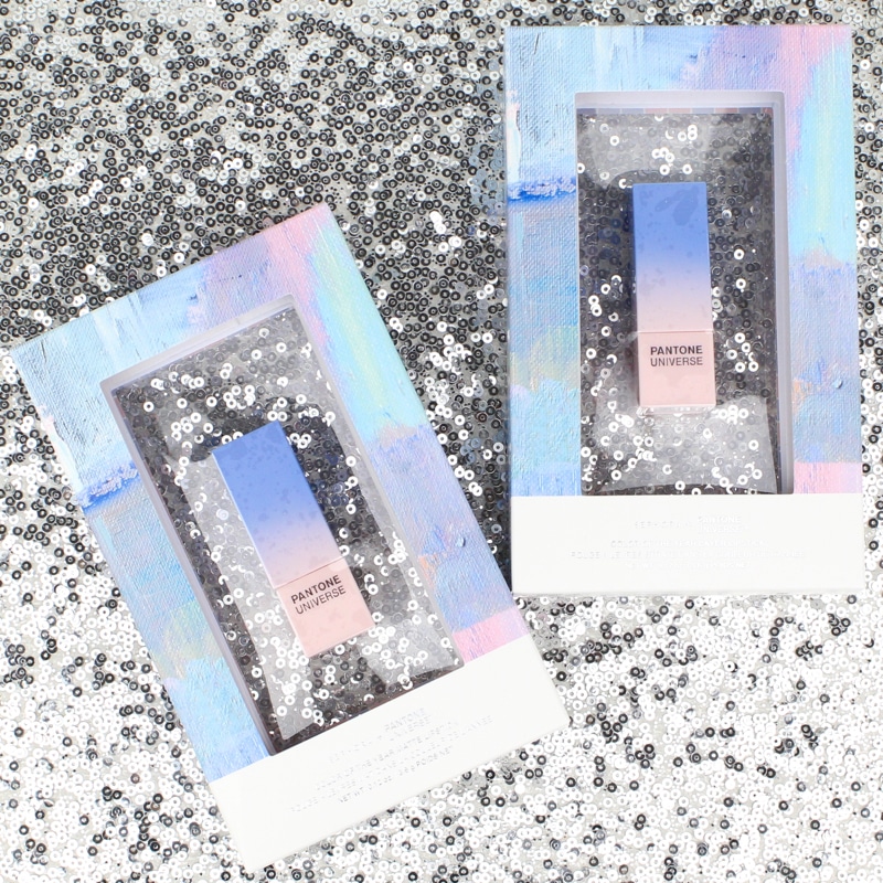
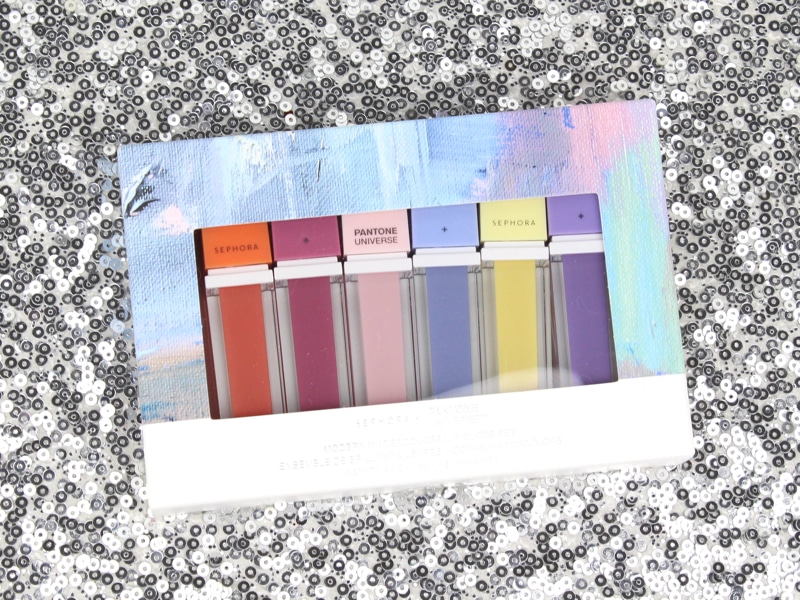
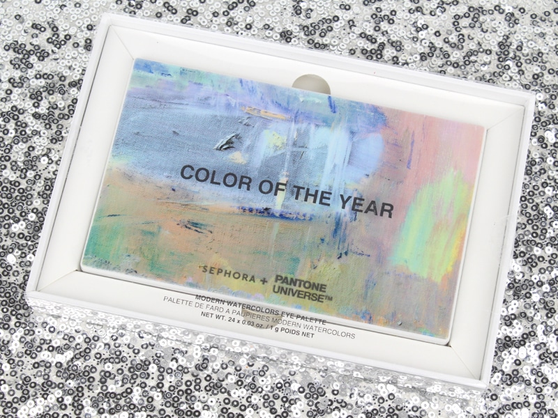
I really love what they have done with the packaging of this collection. Even the inside of the boxes have a lovely pattern and the Pantone color numbers of all the shades of the products are listed on the packaging as well!
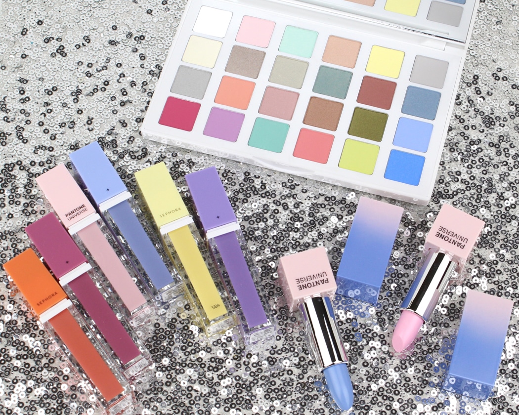
The products in the collection will include:
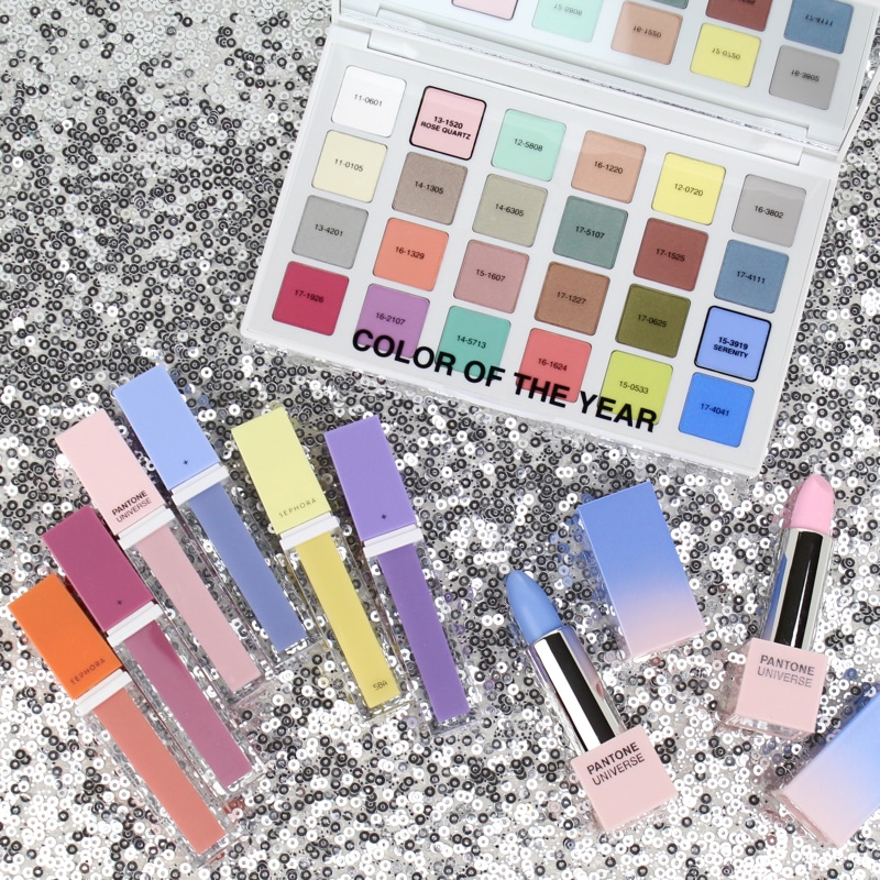
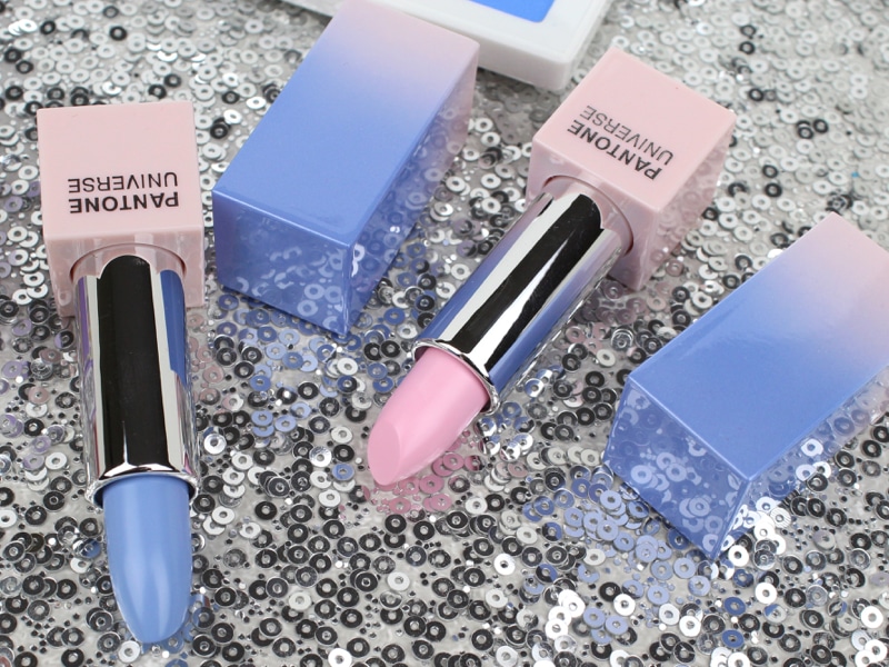
SEPHORA + PANTONE UNIVERSE Color of the Year Layer Lipstick ($23.00 CAD) Dress up your lips with creamy, bold coverage and an unmistakable attitude with a high coverage pastel in the timeless shade of Rose Quartz. Encased in a luxurious ombré component, the ultra-moisturizing formula is enriched with a blend of emollient oils and waxes for a velvety feel and high-shine finish.
This is a very pale pink lipstick with amazing opaque color coverage. This shade would obviously be difficult to wear alone but is very versatile for creating ombre lip looks or lightening other lip shades.
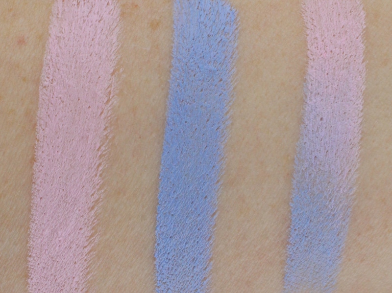
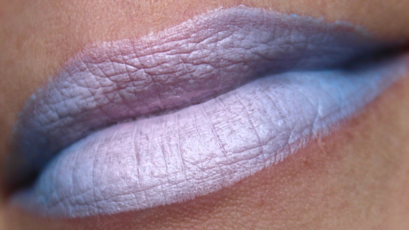
SEPHORA + PANTONE UNIVERSE Color of the Year Matte Lipstick ($23.00 CAD) Explore the adventurous side of this modern color story with Serenity, a rich pastel blue. A high concentration of ultra-thin pigments incorporated into the same ultra-hydrating lipstick formula offers a radically intense, satiny finish on the lips. Sephora PRO tip: Apply either Rose Quartz or Serenity to your bottom lip and then rub the top into it for a modern, light gradient effect. Make sure there is enough color on the top and if not, reapply to the bottom lip again and repeat. Or, layer together for an on-trend ombré look.
This lipstick doesn’t hold back. Full, opaque pastel blue color coverage with a satin finish. It’s so fun to play with ombre looks using this shade. If you have the nerve you can certainly wear it solo.
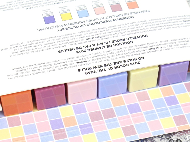
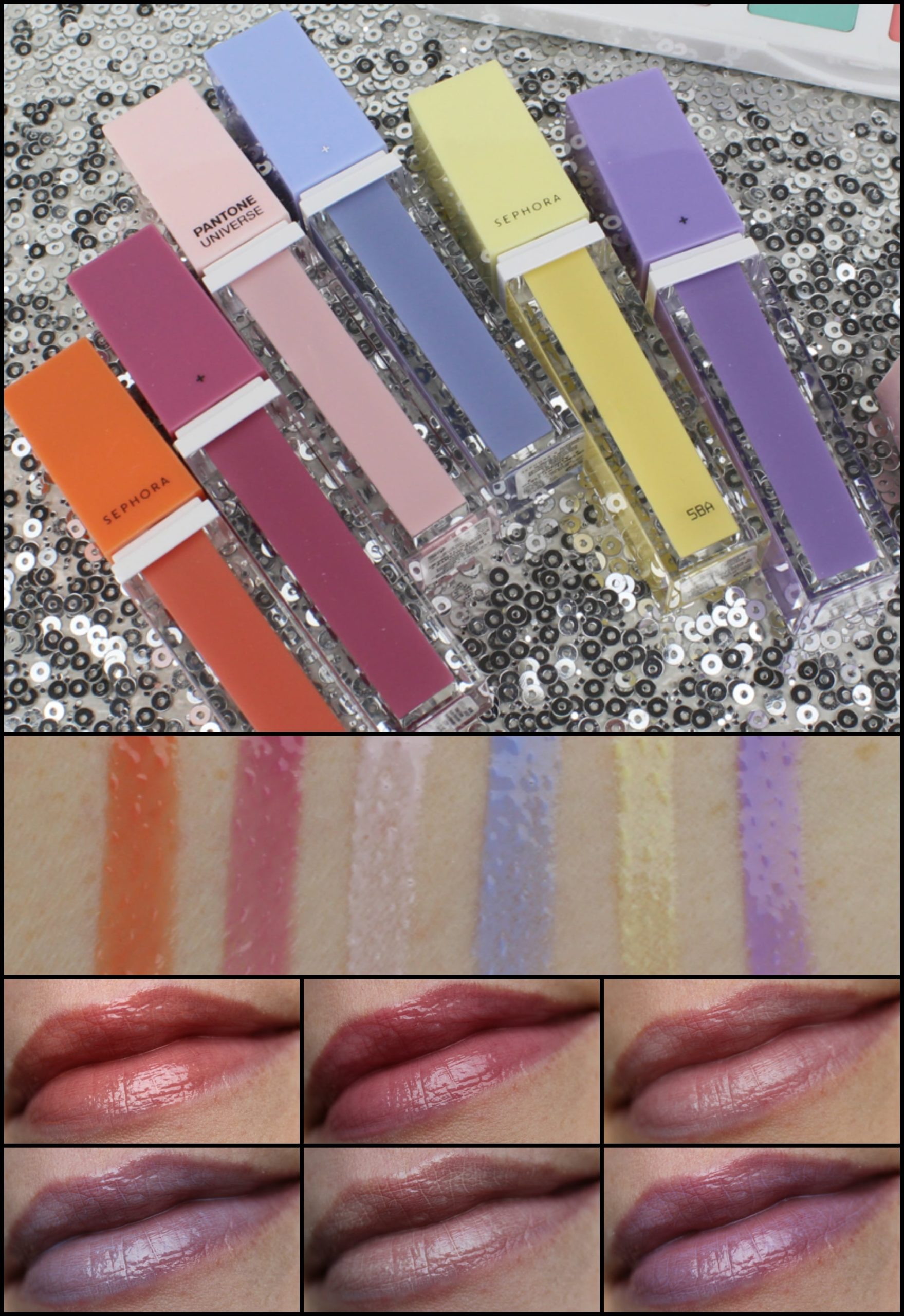
SEPHORA + PANTONE UNIVERSE Color of the Year Modern Watercolors Lip Gloss Set ($35.00 CAD) Bring out your playful side with the perfect pop of pastel color. This set of 6 high-shine glosses is a beautiful synergy of unique but wearable shades, including Serenity and Rose Quartz, which impart a luxurious and cushiony feel to the lips.
These lip glosses have a beautiful, lightweight, non-sticky creamy texture. Given the pastel colour palette these lip glosses are understandably a bit milky and can collect in lip lines. I was surprised that these lip glosses offer a decent amount of pigment. Normally when you see really fun pastel shades like this they are so sheer they all look the same. Not with the Watercolours set. You can certainly see the colour. I think these will likely work best for layering over lipsticks.
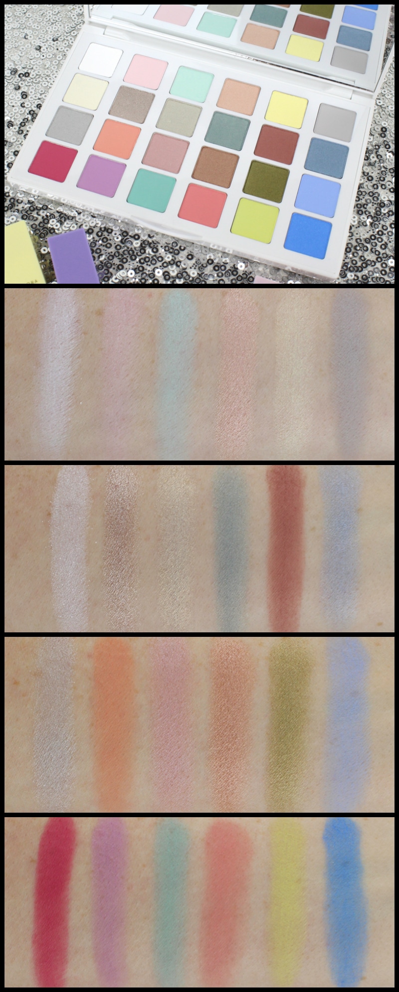
SEPHORA + PANTONE UNIVERSE Color of the Year Modern Watercolors Eye Palette ($49.00 CAD) Discover 24 deliciously enticing shimmer and matte eyeshadows in a sleek, sophisticated palette. The range of fresh colors includes both Serenity and Rose Quartz, as well as unexpected neutrals, chic pastels, and pops of color that work together brilliantly to provide varied looks. Mix and blend any of the longwear, high-pigment formulas to create soft focus effects, pastel smoky eyes or gradient looks.
This is such a unique eyeshadow palette. I can’t think of any other palette that has this type of shade offering. The shadows come in a range of finishes. There are 11 mattes and 13 shimmer and sparkle shades. The shades for the most part are quite light and soft with a couple deeper and brighter shades thrown in the mix. I think this makes it most suited to lighter skin tones but I am looking forward to seeing how those with deeper skin tones make out with this palette. I haven’t had the opportunity to wear and test all the shades in the palette, as there are so many, but overall the formulas are quite good. The pigmentation is really decent overall and with a primer I think this palette will perform really well. All the shades swatched really well and even the pale pastel mattes didn’t seem chalky or troublesome. I think this is going to be such a fun palette to play with come spring!
What are you most looking forward to from this collection?
Shop the collection:
The SEPHORA + PANTONE UNIVERSE Color of the Year 2016 Collection will be available soon exclusively at Sephora stores and Sephora.com for a limited time.
Leave a Reply